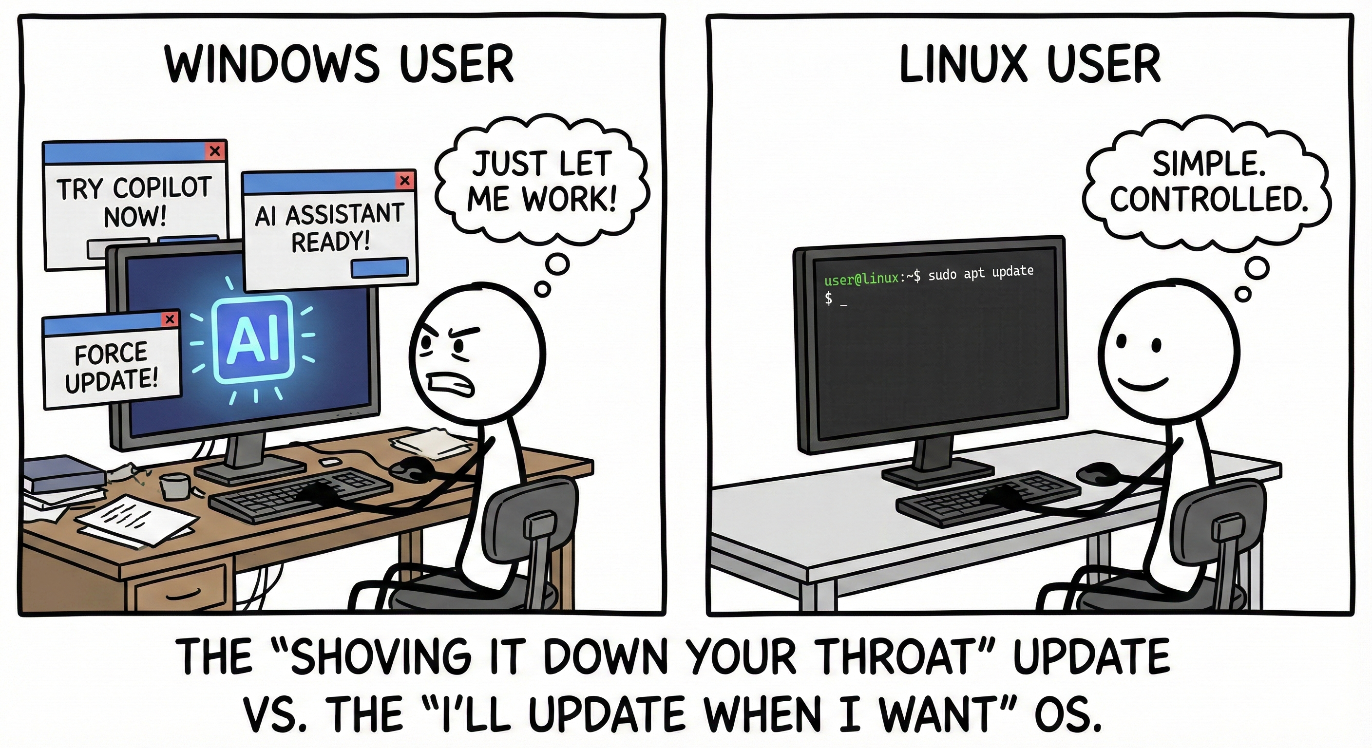
For me it’s the text (too regular and perfectly-ruled to be hand lettered, but too much variance between the letterforms to be a font) and the little AI artifact on the random doohickey directly under the bottom left corner of the AI computer monitor:
Aside from that, it’s just the weight of unmotivated choices. Why is the “good” side of the image grayscale while the “bad” side is in color (a human probably would’ve done it the other way)? Why are the desks drawn slightly differently while the person, chair, and computer are drawn the same (a human would’ve probably made everything identical to better illustrate their point)? Why all the random clutter on one but not the other (if the point was to make the AI computing experience look scattered and cluttered, surely they would’ve made it more overwhelmingly cluttered, but if it was for verisimilitude they’d have put clutter on both desks)? Also, subjectively, the “AI” logo on the screen suggests a pleasant experience, not an oppressive one.
An unmotivated choice on its own isn’t necessarily an AI calling card, but enough of them together alongside one or two smoking guns can definitely make the case pretty strongly.

Because it is
Help me out here whippersnapper, all I can see that is suspicious is the coffee cup and grey note next to it, but everything else looks clean
For me it’s the text (too regular and perfectly-ruled to be hand lettered, but too much variance between the letterforms to be a font) and the little AI artifact on the random doohickey directly under the bottom left corner of the AI computer monitor:
Aside from that, it’s just the weight of unmotivated choices. Why is the “good” side of the image grayscale while the “bad” side is in color (a human probably would’ve done it the other way)? Why are the desks drawn slightly differently while the person, chair, and computer are drawn the same (a human would’ve probably made everything identical to better illustrate their point)? Why all the random clutter on one but not the other (if the point was to make the AI computing experience look scattered and cluttered, surely they would’ve made it more overwhelmingly cluttered, but if it was for verisimilitude they’d have put clutter on both desks)? Also, subjectively, the “AI” logo on the screen suggests a pleasant experience, not an oppressive one.
An unmotivated choice on its own isn’t necessarily an AI calling card, but enough of them together alongside one or two smoking guns can definitely make the case pretty strongly.
There are cables in the windows side but not the Linux side, which also seems like an odd choice for a human to make to me.
Agreed, good catch.
All good points, thanks for this
It’s becuase they told the ai to make the right side simple so it simplified everything.
It’s not just ai slop, they also used sloppy prompts.
The desk and the colours too. Impressive prompt predicting from you, are you sure you’re not ai?
What an astute and flattering observation! You are good and smart.
I am 100% real. Trust me bro.
If you’d like I can provide a list of human organs I contain. Would you like me to do that now?
It’s the hands. not enough fingers.