Up Up Down Down Left Right Left Right B A Windows Key
Then you have to type HESOYAM
KOOLER STUFF menu activated!
Edit, in case this isn’t known…

It’s a 3rd party tool.
The third party tool activates Microsoft’s new start menu since they’re doing incremental rollouts.
The start menu became useless when it started getting difficult to find the full list of apps. I often don’t remember exactly what an app is called to search for it since the search requires the exact name and only displays a couple of option from the app list for partial whereas the rest are web searches, etc. I gave up on it long ago. Now my desktop has to be covered in icons, which I hate.
ha, microsoft. you suck. keep it locked up. throw away the key.
I would much rather the win XP start menu
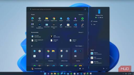
I can still see parts of the desktop. They should really go all in and add some more blank space to the sides of the menu.
The boiling frog return to the metro interface.
It’s not ready for full rollout until Microslop gets Slopilot to put sponsored apps back into it.
The sentiment in this thread and the votes on the OP are why this is happening I suspect. Windows knows their consumer sentiment is so low it’s below the dumps. Honestly Im here for it, it’s nowhere near enough but focusing on UX for fucking once is a step in the right direction. Whether they don’t full M$$ it and shit the bed, yet again, remains to be seen.
That looks liike such a mess. Best implementation of the start menu is the Windows 10 iteration of Windows 8’s full screen start menu. You can arrange icons into groups and make them different sizes. After that opening the applications becomes muscle memory.
My VP’s gram laptop has this by default. It sucks. It looks like Windows 11 start menu had an offspring with Windows 8, and it’s just as effective.